
i think this picture is really cute because the baby toddler is walking really proudly in a little suit and with a red tie all done up, and there is another in the background paying for the taxi, i just think it is cute, and very well made because you will never actually see a baby toddler do this.

i think this picture i quite funny because the person is in a little bath and does not really need a life guard. but instead there is a big tall chair, a life guard and a floating ring just in case he does somehow drown, i like how the person in the bath is not actually bothered by the life guard.

i like this picture because it has a bit of humour in, mainly because this is like every fisherman's nightmare, and this fisherman is just sat there with seagull's attacking his fish on the line, but the water doesn't look like water on this, it just looks like tiles on the floor, and there are loads of birds after one fish. this picture doesn't actually look edited at all, it just looks likes one unlucky fisherman.

this picture i quite funny because there are giant ice steps in the water and it must be in the arctic where it is freezing and this man is just chilling in swimming trunks and a float to lye on, but this picture makes it look warmer because of what the man is wearing, there is also a bit of shine on the man which makes it look like the sun is out and warm, the picture does not look edited, even though there is a man chilling in water with ice it still does not look edited, i like how that all of the picture has low amounts of colour, and the man is in the middle with some colour coming of him, but not that much colour that it ruins the picture.

I think this is very clever, i like how there is a man of amour led on the boiling beach and there is a woman in a bikini outfit wiping sun cream on the mans back, and the shine of the amour makes him look really hot and if you touch him you could burn or something, and i honestly have to say i do not know which bit is edited in this picture because the man and the woman could be led down and the background was edited it or the man of amour was edited in.

this is one of many of my favourite pictures, i think this is really clever, and how they have done it must of been very good, i also like how his ski's are also metal and instead of the hand bits on ski's he has the ones to hit other armoured people with. so it looks even more funny, i also like how there is some snow flicking up at the back of the ski's when he is moving,and how the sky is all clear to get a nice image of the armoured man, and how most of the snow looks untouched and clean.

i think this picture is amazing, the fact that you cant really put metal in a washing machine, and he is there with just his under garment with his cute little socks that are wierd and pointy and that he still has he helmet on but the rest of his suit is in a washing basket, and that he obviously can't fit all of his suit in that little tiny basket, but there is only the leg and foot armour hanging on top is very clever.

i like this image and how the women has twins and is hanging of the pram and that the background looks blurred and makes the pram looks like its going really fast down a hill, and how one of the babies has a huge smile on its face, and the other baby just looks scared. this picture looks a little bit edited on the shoes and on her legs, and the pram does look edited a little, but other then that i think this is a very good picture.

i think this is an amazing picture, i like how the bear has a towel on its forearm, and how it is folded like a waiters cloth, and how he is trying to catch a fish with his paw, and how in is picture he has nearly caught the fish, this picture does look a little bit edited with the fish, and how the water also looks really fake, which is kind of upsetting because this picture would of been even better,

i think this picture is amazing because of the fact that a couple of men a turning a new looking road beck into grass, and that they are rolling it onto the road to loose the road, the only main bad thing about this picture is that the men look kind of plastic, but it still looks real, and i also dislike the fact that after the grass has been placed, i don't like that the bars from the side of the road is still there, but i also like how long the road is and how much work the men have to do, it makes it more realistic.

this picture i actually find really really funny, i like how there is a sign on the floor of the road that says women, this could be an insult to women, or it could be a complement by being women, we are that awesome that we get our own side of the road, i like how the picture and the road is empty of people, and the road is really long and there is some like getting through further on in the picture, i also like that there is some lights on the side of the building that then gets covered by shadows, and how the road on the floor starts of dark, and then gets lighter.

i like this picture because the men are on a sofa, on a thin metal pole and they are really really high, and they all have brews and food, i think this is very clever, because i don't think any man would actually do this, and to put the sofa in is even more clever, i like how you can see all of the other buildings in the background as well. and i also like how they still have their helmets on and how the helmets and the orange sofa are the main pieces of colour in this picture, and i also like that there is steam or smoke coming up from the building, and how the picture isn't to bright and how there isn't that much colour or darkness in the background, but it still looks a bit musky and plain.

i think this picture is actually amazing, i like how there is a plain bedroom, with not that much in it, and how there is a women in the middle of the bed, on top of the covers, but is sinking into it like the bed is water, but the bed it only looks like the middle is liquid because her hands are placed on top of the quilt and her head and pillow are still on top of the quilt and not sinking in to the bed, so it makes the bed look a bit like a hot tub shape or something, the colours in this picture must have been thought out well, because the colour of the quilt makes it look a bit more thick then water, but instead looks a lot like liquified metal. i also like how the rest of the bedroom isn't blown away by loads of different colours, and how it is just kept to a simple silver and white bedroom to keep all the the information in the picture, and so i main editing isn't getting overwhelmed by different things.
 i think this picture is really cute because the baby toddler is walking really proudly in a little suit and with a red tie all done up, and there is another in the background paying for the taxi, i just think it is cute, and very well made because you will never actually see a baby toddler do this.
  i think this picture i quite funny because the person is in a little bath and does not really need a life guard. but instead there is a big tall chair, a life guard and a floating ring just in case he does somehow drown, i like how the person in the bath is not actually bothered by the life guard.
 i like this picture because it has a bit of humour in, mainly because this is like every fisherman's nightmare, and this fisherman is just sat there with seagull's attacking his fish on the line, but the water doesn't look like water on this, it just looks like tiles on the floor, and there are loads of birds after one fish. this picture doesn't actually look edited at all, it just looks likes one unlucky fisherman.
 this picture i quite funny because there are giant ice steps in the water and it must be in the arctic where it is freezing and this man is just chilling in swimming trunks and a float to lye on, but this picture makes it look warmer because of what the man is wearing, there is also a bit of shine on the man which makes it look like the sun is out and warm, the picture does not look edited, even though there is a man chilling in water with ice it still does not look edited, i like how that all of the picture has low amounts of colour, and the man is in the middle with some colour coming of him, but not that much colour that it ruins the picture.
 I think this is very clever, i like how there is a man of amour led on the boiling beach and there is a woman in a bikini outfit wiping sun cream on the mans back, and the shine of the amour makes him look really hot and if you touch him you could burn or something, and i honestly have to say i do not know which bit is edited in this picture because the man and the woman could be led down and the background was edited it or the man of amour was edited in.
  this is one of many of my favourite pictures, i think this is really clever, and how they have done it must of been very good, i also like how his ski's are also metal and instead of the hand bits on ski's he has the ones to hit other armoured people with. so it looks even more funny, i also like how there is some snow flicking up at the back of the ski's when he is moving,and how the sky is all clear to get a nice image of the armoured man, and how most of the snow looks untouched and clean.
 i think this picture is amazing, the fact that you cant really put metal in a washing machine, and he is there with just his under garment with his cute little socks that are wierd and pointy and that he still has he helmet on but the rest of his suit is in a washing basket, and that he obviously can't fit all of his suit in that little tiny basket, but there is only the leg and foot armour hanging on top is very clever.
 i like this image and how the women has twins and is hanging of the pram and that the background looks blurred and makes the pram looks like its going really fast down a hill, and how one of the babies has a huge smile on its face, and the other baby just looks scared. this picture looks a little bit edited on the shoes and on her legs, and the pram does look edited a little, but other then that i think this is a very good picture.
 i think this is an amazing picture, i like how the bear has a towel on its forearm, and how it is folded like a waiters cloth, and how he is trying to catch a fish with his paw, and how in is picture he has nearly caught the fish, this picture does look a little bit edited with the fish, and how the water also looks really fake, which is kind of upsetting because this picture would of been even better,
  i think this picture is amazing because of the fact that a couple of men a turning a new looking road beck into grass, and that they are rolling it onto the road to loose the road, the only main bad thing about this picture is that the men look kind of plastic, but it still looks real, and i also dislike the fact that after the grass has been placed, i don't like that the bars from the side of the road is still there, but i also like how long the road is and how much work the men have to do, it makes it more realistic.
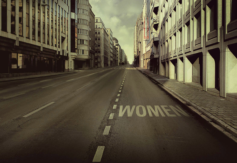 this picture i actually find really really funny, i like how there is a sign on the floor of the road that says women, this could be an insult to women, or it could be a complement by being women, we are that awesome that we get our own side of the road, i like how the picture and the road is empty of people, and the road is really long and there is some like getting through further on in the picture, i also like that there is some lights on the side of the building that then gets covered by shadows, and how the road on the floor starts of dark, and then gets lighter.
 i like this picture because the men are on a sofa, on a thin metal pole and they are really really high, and they all have brews and food, i think this is very clever, because i don't think any man would actually do this, and to put the sofa in is even more clever, i like how you can see all of the other buildings in the background as well. and i also like how they still have their helmets on and how the helmets and the orange sofa are the main pieces of colour in this picture, and i also like that there is steam or smoke coming up from the building, and how the picture isn't to bright and how there isn't that much colour or darkness in the background, but it still looks a bit musky and plain.
 i think this picture is actually amazing, i like how there is a plain bedroom, with not that much in it, and how there is a women in the middle of the bed, on top of the covers, but is sinking into it like the bed is water, but the bed it only looks like the middle is liquid because her hands are placed on top of the quilt and her head and pillow are still on top of the quilt and not sinking in to the bed, so it makes the bed look a bit like a hot tub shape or something, the colours in this picture must have been thought out well, because the colour of the quilt makes it look a bit more thick then water, but instead looks a lot like liquified metal. i also like how the rest of the bedroom isn't blown away by loads of different colours, and how it is just kept to a simple silver and white bedroom to keep all the the information in the picture, and so i main editing isn't getting overwhelmed by different things.


